Better School Choice
MOBILE APPLICATION
Overview
School search
Design a product for finding the right school
Client requested a product to help parents of K-12 aged children search for a nurturing and academically strong school by:
Identifying the needs of parents
Hypothesizing solutions
Developing and prioritizing features that aid towards user goal.
Creating a product that is effective, competitive and marketable.
Goal
Empowering tools
Effective tools that lead to solutions
Using research and analysis, goal was to imagine features that help parents research, compare and evaluate schools to match the child’s needs. The design needed to be effective, marketable and pass usability testing.
School search
Resource portal
Best-in category
Social hub
School analysis
Role
Shutterstock.com Image
Research & design
A multi-hat role in UX, UI and research
Research, analysis and synthesis of data,
Planning the appropriate experience and flow,
Designing a visually attractive product.
Audience
Parents
Passionate and dedicated parents of children K-12.
Parents of at least one child ages 5-18.
A mid-high income.
Searching for “The” school through research, first-hand interviews and a positive “gut reaction”.
Discovery
Listen & learn
How user interviews lead to creative solutions
By listening to parent interviews, I discovered commonalities such as the influences on their decisions, pain points experienced, tasks performed, their emotions and goals. Specifically, parents need more resources and direct communication with schools to identify the correct environment for their child.
I hypothesized that by creating features that allow a parent to search, analyze school data, read resources, see the school in perspective to others in the state, and directly communicate with staff, alumni or other parents, I would provide an effective product and creative product solution for the users and stakeholders.
Solutions
My tool drawer
Affinity diagram:
Need for supportive and nurturing environment.
Resources for learning about different schools.
Communication with staff or alumni.
Need for proximity and budget that fit.
Small class size
Demographic and economic diversity of students based on merit.
Curriculum that features:
Teaching approach aligning to parent’s philosophy.
Strong academics, variety of facilities.
Support excellence and progress in a variety of skill sets.
Teaching approach that adjusts to chid’s evolving needs.
Empathy map:
The user’s emotional motivations:
Concern with current system and nervousness towards finding the right solution.
Curiosity for alternative options and confidence in their intuition.
Competitive analysis -
The following key insights were revealed:
Strengths:
Articles and resources.
Best-in school categories by state.
Focus on schools, no divergents.
Detailed statistics.
Weaknesses:
Academic details limited to Math
and English.Poorly designed UX and UI
Lack of search by zip code.
No reviews by parents or alumni.
Competitor threats:
Offers resources.
Engaging, clear interface design.
Detailed data visualization.
Best-in category lists.
Opportunities:
Expand academic statistics to more subjects.
Search filters.
Enhance data visualization.
Include social proof.
Direct communication with staff.
JTBD Framework -
Research school options.
Narrow down a list of schools based off of performance and environment.
Make a list of core features I want in a school.
Go on school tour, speak to school representatives.
Apply child to school of choice.
Follow-up with staff on adjustment and progress of child.
Solutions -
The following solutions were applied:
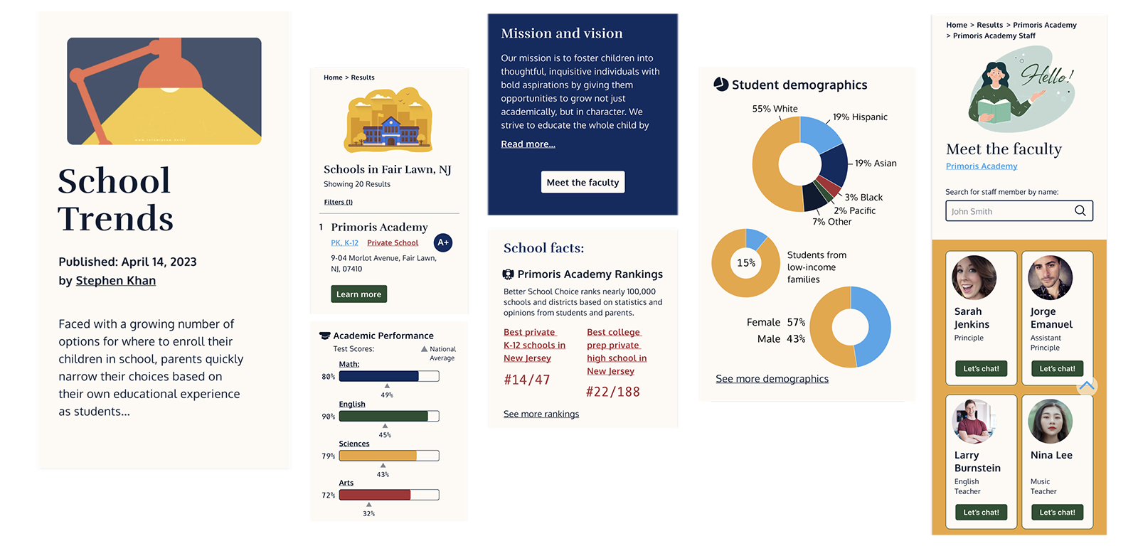
School search feature by zip code with filters.
Environment of school by student to teacher ratio and facilities.
School grade by product’s evaluation metrics.
Chat with faculty
Detailed statistics with clear and easy visualization of data.
Resource portal with articles and worksheets.
Book a school tour.
Social Hub for communication for staff, parents or alumni.
Statistics on school demographics.
Best-in category comparison by state to provide performance.
Academic strength based on Math, English, Arts and Science including indicators of state averages.
Test hypothesis -
Using low-fidelity prototypes and conducting a usability test that tasked the user to search for a school and speak with a teacher.
Results
Human touch & digital solutions
Using corrections towards better solutions
The new product had powerful tools to help parents search schools for best fit using:
Filtered search
Analysis of school performance
Comparison of school within perspective of the state
Resource articles for parents
Communication hub
for alumni, staff and other parentsDirect parent-to teacher chat
However, the usability test was partially successful:
User could complete the task, but...
Trouble with the navigation
User felt intimidated chatting directly to the staff.
I adapted to the user’s feedback:
Enhancing the user experience
Clarifying my navigation labels
Crafting a flow that was more natural and logical.
Providing the right tools at the right time.
As a result, the product’s features empowered parents with information and first-hand interviews of the school staff and had a marketable, competitive advantage.
Reflections
Shutterstock.com image
One step back, two steps forward
Pairing analytics with human connection
Learnings:
Overcoming task flow challenges by clarifying navigation and guiding the user through a natural and logical experience,
allowed me to incorporate the chat feature I had envisioned to be both empowering to users and marketable. This insight will guide me through the next sprints.
The next steps:
Test the prototype again with the users
Create additional prototypes of features and flows.


